#OrchidsandOnions: Checkers Sixty60's response to Springbok jersey wins hearts
Good. Then, as my mother once used to say, if you believe that, I have a farm in Adderley Street you may be interested in…
Comfortable brand
If indeed the jerseys were designed with the sight-impaired in mind, then it must be one of the happiest coincidences in the history of marketing that the main colour chosen happened to almost exactly match that of the prime shades of two of the Boks’ most prominent sponsors, FNB and Checkers sixty60…
Now, while some arrogant and haughty brands may’ve have reacted with outrage at the merest suggestion that the outcome was pre-arranged, I love the way that Checkers sixty6o did the exact opposite and turned the momentum of the questioning around into a funny gag at (sort of) its own expense.
And that is a sign of a brand not only comfortable in its own marketing skin, but one which also realises that it has achieved household name status – and it is, as the leader in the field of home-delivered groceries – and can afford to take risks with its reputation.
In the end, though, it’s not much of a risk because – and this is something brands which take themselves too seriously don’t realise – South Africans love a bit of self-deprecating humour.
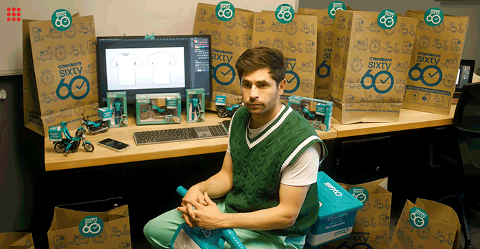
So, we see a short little video, which opens at the door of the “kit designer” – and the colours of the sign leave you in no doubt that this is the Springbok “designer”.

He complains to a colleague that he has had about 600 people phoning and asking him where he got the inspiration from for the away kit design.
“I don’t know…I’m an artist. It’s hard to tell. You tell me…”
His colleagues wonders if it might not be Sixty60 – and the video cuts to his office, where he is surrounded by Sixty60 boxes and is even sitting on the cute kiddies’ plastic motor bike that Checkers are selling now.
He doesn’t even ponder the suggestion because his phone rings and he says “that’s my order” before scooting off.
The punch line is also a giggle: “It wasn’t us. But it might be our fault.”
You have to laugh… and if you did harbour suspicions about how the design happened, then you don’t really care. And, of course, you see the brand – and every other time you see the Boks in that kit, you’ll see sixty60.
Great marketing and a nice video execution. So Orchids to Checkers sixty60 and to Panther Punch (Glen Biderman-Pam, Oliver Booth and Michael Veltman).
Flying low
For the Onion, I am shamelessly stealing one from a post I saw on the FlyAfrica Facebook page (required material for avgeeks), posed by David Barras Baker.
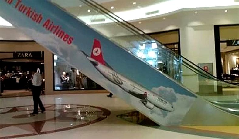
It is a pic of a Turkish Airlines ad plastered on the side of a shopping centre escalator….as it heads down. It looks for all the world as though the plane is nose-diving. Not the sort of look you’d use if you wanted to encourage customers to fly high with you.
For the worst example of ad placement I‘ve seen in quite a while (as good, or bad, as the Emirates Airline one a few years ago flighted during an ad break on “Air Crash Investigation”) Turkish Airlines– or more particularly, their media agency – gets an Onion.